Wednesday, October 17, 2012

Photo critique


1)
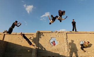
This picture is good because it is a subject that represents a culture - a group of youths in Palestine having fun. The photographer has obviously got to know the subjects to know why they are jumping over objects and what their sport is exactly all about. The photographer has captures a moment which makes the image out of the ordinary.


2)
Contrast in the photograph - the young woman is dressed in beautiful clothes and makeup but has an unhappy look on her face. The portrait is up close - something which many photographers make the mistake of not doing. The photo is taken just of her face, which makes it more interesting than if it was of her whole body. Her expression is also really interesting.


3)
An expression of gesture captures that is 'out of the ordinary' would have made this photo more interesting. The photographer could have got closer to the tv viewers. The photo doesn't really convey the mood of the story - getting closer to the students in the picture would make it better. Also a better use of lighting would make it more appealing and striking.


4)
Use of background subjects would make this photo better, as it needs to be in context. A contrast between a 'normally dressed' person and the poorly dressed girl would create interest. Showing several photographs of different people in bad fashion would show a broader snapshot of the community.
Tuesday, October 16, 2012

Good vs Bad By Matthew Sousa

GOOD PHOTOS:


I think this photo illustrates a horrific site of what locals in the area were experiencing and rightfully caught the attention of people across the globe.

The photo is the “Pulitzer Prize” winning photo taken in 1994 during the Sudan Famine.
The picture depicts a child crawling towards a United Nations food camp, located a kilometer away.

The vulture is waiting for the child to die so that it can eat him. This picture shocked the whole world. No one knows what happened to the child, including the photographer Kevin Carter who
left the place as soon as the photograph was taken.
Three months later he committed suicide due to depression.


This is a photo of a couple that made headlines worldwide. It occurred during a riot in Vancouver when their NHL hockey team lost in the finals.
They were known as the kissing couple.

The photo captivates anyone’s attention that comes across it. It’s extremely powerful considering the focus point and its surroundings and the reason why I consider it a great photo.


BAD PHOTOS:


This is a photo during the Occupy Atlanta movement that took place last year and it captures a young man getting his face slammed into pavement which is the main point of the picture. However, it’s not clear as the police officer is in the way of what the photographer is trying to capture.


I found this photo which I think was poorly taken. It demonstrates Protesters taking over a street during the Occupy Atalnta movement. I think it’s a bad picture because of the angle the photographer chose. In The photo would have been much better as a close-up.


Monday, October 15, 2012

Photo Critique

GOOD PHOTOS


Photo: Aykut Unlupinar / Anadolu Agency, European Pressphoto Agency (http://www.latimes.com/news/nationworld/world/la-fg-turkey-syria-escalate-20121015,0,4238026.story)

I like this photo mainly because it's telling a story. It's from an article in the LA Times about how Syrians flee across the border to Turkey. This picture illustrates it quite well, there's no room left and the boat is almost sinking but it still appears to be a better option than staying at home. The colors are also creating a great contrast, the colorful scarves against the drab background colors. I also like how the people are the ones in focus, and how the background is blurry to make the people more exposed.


Photo: John Gambrell / AP (http://news.nationalgeographic.com/news/2012/10/pictures/121003-best-pictures-month-we-love-coral-parkour-dancer/#/best-news-pictures-september-2012-dancer_59837_600x450.jpg)

I think this is a great example of how effective it can be to use contrast in a photo. That was what first caught my attention, an African dancer standing alone in a room with what appears to be a basket case. The person is also placed after the rule of thirds, which puts the dancer in focus. I also like how the photographer has been paying attention to details. There are a lot of things "going on" in this picture, as in there are a lot of small things to notice, but at the same time the picture feels calm and still. The body language of the dancer probably has something to do with it. I also like how the light is falling over the room, and how a piece of the window is showing and letting in some more light.


BAD PHOTOS


Photo: Heiko Junge / European Pressphoto Agency (http://www.nytimes.com/2012/10/13/world/nobel-peace-prize.html?ref=europe)

First av all there's just too much going on in this picture. I guess the man behind the podium is suppose to be the center of attention, but instead it's the man with the blue mic who's in focus. I wouldn't have chose a picture where the man who's talking to the journalist has his eyes closed. I also think this picture could be cropped much more tight than this. The point is probably to show how much of attention this press conference caused, but it makes me focus on the notebook and the camera lens in the foreground, instead of the man talking. There should also be more light on the man behind the podium, and less light on the journalists standing on his right.


Photo: Stefan Berg (http://www.gp.se/nyheter/goteborg/1.1095596--en-del-vill-ta-bort-gamla-karlekar-)

This photo could also have been cropped more tight. I think it's disturbing that you can see a piece of a picture frame and something blue (no idea what it is) in the left corner. The fluorescent lamp could probably also be cut out of the picture. I also think the picture is a bit too dark, it would be better with some more light in the background. The picture in the foreground of the picture is also disturbing, since it's so out of focus. I see that the point was to actually show the man behind the disk, but in that case the picture in the foreground is both too big to be so out of focus and also too close to the lens.